Have you ever noticed how you’re drawn to certain colors? Whether you’re looking to repaint a room, buy a new duvet cover, or simply looking at pictures online, a lot of the decisions that are made are influenced by the color and what it can relate to. Think about it — doesn’t a light blue bedroom sound ideal? Or wearing a bright orange top to that big race this weekend? Believe it or not, it’s all in the color.
Colors are often associated with specific words or environments and, as a result, evoke different emotions in people. Yes, colors have an effect on your mood. Call it color psychology. Artists and interior designers are experts when it comes to understanding how color greatly impacts moods, feelings, and emotions. It is recognized as a powerful tool to communicate action, mood, and influence physiological reactions.
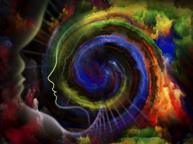
This might not have come as a surprise to many, but for those of you who already recognized the effects, do you know what each color represents? In a general sense, colors in the warmer area of the spectrum like red, orange, and yellow influence emotions that can vary from warmth and comfort to anger and hostility. The opposite side, with cool colors like blue, purple, and green, can evoke feelings of sadness, apathy, and also tranquility.
“We react on multiple levels of association with colors — there are social or culture levels as well as personal relationships with particular colors,” says executive director of The Color Association of The United States, Leslie Harrington. “You also have an innate reaction to color. For example, when you look at red, it does increase your heart rate. It is a stimulating color. This goes back to caveman days of fire and danger and alarm.”
Interesting stuff, right? Maybe it’s common sense that red can signify danger, but I’d bet a lot of people didn’t know that this association derives from our primal instincts. Turns out, a lot of the colors on the spectrum have hidden meanings that aren’t typically known. Once you read about them, you’ll be on your way to becoming a color psychology expert! You might even become a little obsessed with it.
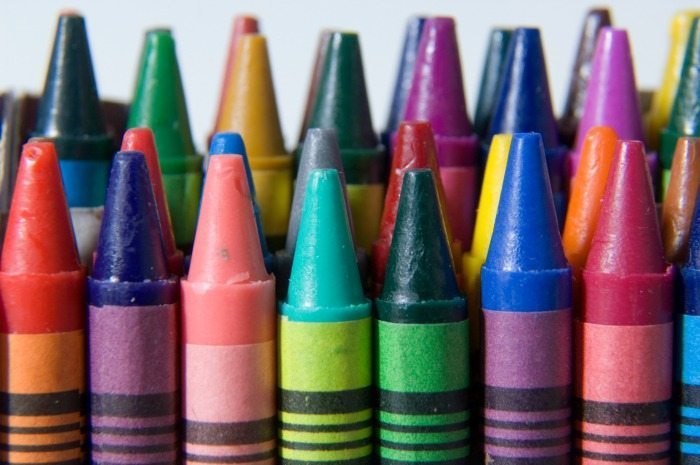
- Red: Evokes emotions like fear, anger, and passion. It also attracts attention — in a passionate way. Think “red light district.” Pale red, like pink, becomes sweet and innocent, whereas a darkened red represents sophistication.
- Orange: Signals action, endurance, and creativity. It’s edgy without taking too much of a risk. It is an enthusiastic color that’s full of vitality, making it popular in active wear.
- Yellow: While often associated with happiness and sunshine, it can also have negative connotations like jaundice and illness. It can be overpowering if it is used too much. Yellow has benefits of enhancing concentration and the potential to speed metabolism.
- Green: Has connections with the environment, vitality, and new growth. It is a refreshing, relaxing color and its shades bring feelings ranging from sophistication to liveliness. Since it’s an easier color on the eye, it is said to help improve vision.
- Blue: It takes you down to a peaceful level by lowering your blood pressure. In addition to bringing tranquility, it is also associated with strong attributes like trustworthiness, strength, and dependability.
- Purple: Resembles royalty and luxury. It can evoke feelings of confidence, maturity, and sophistication — making it a good color to wear for job interviews. Purple also is associated with wisdom and spirituality.
Which colors do you often associate with?
All images via Thinkstock





![Daily Bite [Make]: Philly Cheesesteak Stuffed Bell Peppers](https://dashofwellness.com/wp-content/uploads/2013/01/Philly-Cheesesteak-Stuffed-Pepper-Daily-Bite-1-100x70.png)

Hmm, well I tend to wear all black-if I do wear color it is usually some red or olive green. But I am convinced that differently colored foods taste really different!